


 You can have one or two
columns which can be just text, images, or a combination of text and
images. You can choose fonts, font sizes, font colors and create links You can have one or two
columns which can be just text, images, or a combination of text and
images. You can choose fonts, font sizes, font colors and create links |
 |
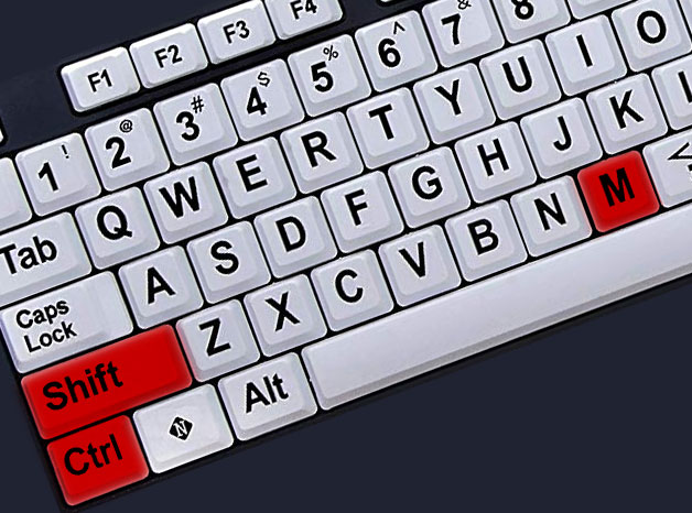 |
| 105Websites creates fully
responsive websites that adapt
fluidly to different screen sizes, such as the desktop, tablet or
phone. Two thirds of all internet browsing is now
done on a smart phone and our product is optimized for narrow screen sizes. Here is tip that is good to know and one that you should try on our website example here. Although you can resize the browser window on the desktop to simulate narrower screen sizes, a better alternative is to use Firefox's responsive mode. View this website in Firefox and then hold down the Shift Key and the Control Key and hit "M". You should now have a slightly narrower window within the main browser window. Roll your mouse over the edge of the window till the cursor becomes a horizontal arrow, then hold down the left mouse button and drag the edge of the window. You will see the size change and the content change accordingly if you are viewing responsive web design. At the top of the inner window is a pull down menu where you can also select devices to simulate. This is a great tool to use to preview your website's appearance on other devices. |


 |
| 105Websites makes it safe and easy to insert your content by utilizing third party online storage or "cloud" solutions. Our recommendation is pCloud, which
has plans ranging from $4 a month to
$175 for lifetime - a fantastic deal. A dependable online,
cloud storage solution is not only perfect for your 105Website, but also
makes a great all-purpose backup and file sharing solution. pCloud
provides direct links to your content as well as free apps for the
desktop and your mobile
device. We also provide a utility for creating direct links using your free or paid DropBox account. PostImage is another free solution. YouTube,
SoundCloud
and Clyp are free solutions for video & audio. |

| There
is a hidden bookmark (anchor) at the top of this section which is
connected to a link further up on the page. By placing links and
bookmarks strategically on the page, you can make it very easy for the
viewer to find and jump to specific content. This is an example of text placed to the right of an image. These are two columns which can be images or text and they "collapse" to a single column when the device - phone or iPad - has a narrower view. The end of each page is indicated by a "flourish" that contains a link to jump back to the top of the page. |
 |


